I have a new cell phone number; the old one stops working next Wednesday (September 30). Contact me via my e-mail or my LinkedIn profile to get the new number.
Sipho is Class President
Sipho Luther Sgwentu has been elected president of his senior class at the American International School of Cape Town.
Congratulations, Sipho! This is just one of your many achievements to date… with even more to come!
Crawlspace Update: Hidden Treasures (?)
My buddy Michael crawled into the dark corners of the crawlspace under the kitchen yesterday (thanks, Michael!) and dug out a variety of trash and artifacts that had been thrown in there over the decades since the house was built (in 1931).
We found a couple interesting things, and solved the mystery of what sort of beast had crawled in there and died in the winter of 2007–8 that made our home reek of death and decay for four weeks that Spring.
First up, a wax cone milk container from Sealright Milk Bottles (Fulton, NY), distributed by Cherry Burrell Corp (Little Falls, NY). It has a copyright notice on the side that says “Sealed Kone: We use Sealright Sanitary Service for Your Protection, Copyright 1932.” The wax cones were single use containers to avoid bottle breakage and other losses from around 1914 into the 1930’s. I found a nice article describing their history at Doug & Linda’s Dairy Antique Site.
Next is a wooden cylinder, made up of 8 individual joined slats and then turned so its outer shell is round. In some quick research, I couldn’t figure out what it was. Maybe a wooden drain pipe or container?
Finally, and not for the faint of heart, the dead beasty. It was a red fox. It had obligingly curled up and died on a piece of fallen Styrofoam insulation. Luckily, the crawl space is very dry, so after those few weeks of decay last year, it became mummified. We see red foxes in the neighborhood from time to time. This one may have gotten into some old rat poison in the crawlspace. It seems like it may have used the space for a nest for a while… there was a squirrel carcass right next to it.
Michael is helping me clean up the electrical wiring mess under here now. Then I can start enclosing it and re-insulating it. Stay tuned.
Garden Orb Photo
We’ve been doing a lot of work in the garden lately (of course), and we recently finished some tree trimming and mulching. I caught this picture of our purple garden orb this afternoon when the sun was shining down through the newly raised canopy of the Yellowwood tree. If you look carefully, you can see most of the elements of our back garden.
UXNet Local Ambassador for Baltimore
I am now the local ambassador for UXNet in Baltimore.
Empathy for Aging Eyes
I recently got a new laptop for work. It’s got a 17-inch screen with a resolution of 1920×1600. This resolution is fabulous for doing mockups, models, and graphics.
However, my eyeballs recently turned 40, and the monitor is approximately 140dpi now. So reading and writing text… not so easy for this aging designer. (I’ve always been very myopic, well corrected with contact lenses. But now the floaters and other acuity problems… ugh.)
So, I started using the 120dpi setting (in Windows advanced display settings) to see how it works with “modern” software. I didn’t hit any crazy problems, so then I decided to push it. I went to 144dpi, which is just about exact real-world measurements on the monitor.
It’s not so good. Lots of software does weird things at that dpi setting, including Firefox. The saving grace is the zoom feature, but many of my plug-ins don’t pay attention to that, so I have a HUGE Twitbin pane on the left of my browser.
I’m going to try and live in this 144dpi world for a while and experience the web and software as other visually-impaired people do. I’ll post my experiences here and on twitter.com/JarrettUX.
Sun Porch Deconstruction – Phase 2
An 18–yard dumpster and a week later, phase 2 of the sun porch deconstruction is complete. While tearing apart the decking, I uncovered an older deck that was much more solidly constructed. And the hot, humid weather didn’t make it any easier. But the decking is now gone, except for a small landing outside the sliding door that we’ll use until we build the patio and new steps.
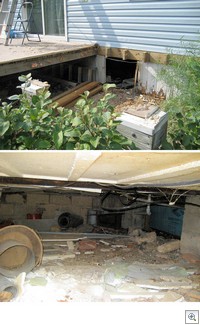
The next step is to tear away all the rotting skirting around the crawl space under the kitchen, clean it out, and insulate it well before we get our new heating system.
The current crawlspace is a mess that steals cooling in the summer and heating in the winter. Plus, last year something large crawled in and died there, sending a putrid aroma throughout the whole house for weeks. Who know what (or who) I’ll find as I clean this out.
Sun Porch Deconstruction – Phase 1
Our house has had a glassed-in sun porch on the back since long before we bought it. It’s is a nearly useless space. It’s too cold in the winter and an oven for most of the rest of the year. Maybe we got a few weeks of use out of it in the fall and spring.
It was also ugly. It was panel-built construction built on top of a deck. It blocked the light into the kitchen, and it was out of proportion to the house. Plus it wrecked the views of the garden from within the house and from the back garden.
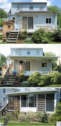
This weekend, I took the sawzall and a sledge-hammer to it, and tore it down to its decking. The deck will be removed as well over the next couple weeks as Phase 2. We’ll be replacing the whole thing with a grade-level covered patio, which will be light, airy, and integrated into the garden. The garden already looks much better without the big glass monstrosity looming over it.
(click for larger photos)
top: phase one deconstruction complete
middle: glass and one wall removed
bottom: earlier this summer before starting deconstruction
In early spring, we had advertised on CraigsList that the porch could be had for free for anyone willing to disassemble and haul it away. We had 100 people express interest in 24 hours. The first seven folks looked at it and decided it was out of their league to do. The eighth person had the tools and the skill and seemed very interested in it. But he ultimately backed out at the last minute. So, we get to tear it out ourselves. I did find someone who wanted the glass from all the windows and doors.
Back to Basics: Most Common UI Problems
About a year and a half ago, we published (internally) a set of 88 UI patterns to help direct design on our various product teams. (The patterns were inspired by and extended from Designing Interfaces by Jenifer Tidwell). Since then, we have based our expert reviews on the patterns, providing both quantitative scoring for comparison and tracking and qualitative feedback like any good heuristic review.  After completing many reviews, a small subset of the patterns emerged as problem areas: almost every design failed to meet the guidelines and intent of these patterns.
What surprised me was how basic this subset of patterns is. They don’t deal with any of the complex interactive elements, nor the deep domain-specific issues we encounter. The problems are primarily in screen and data layout, user support, and error handling. In the big consumer software products and high-volume web sites, I feel like these areas have been mastered, or at least they’ve settled into a moderately usable set of common expectations. In vertical software markets (like ours in industrial automation), it seems that there is still a long way to go before these basics are commonly practiced.
Here’s a quick synopsis of the most problematic patterns:
Western Reader: Left align labels and text, align controls, and left-to-right, top-to-bottom flow through a screen.
Wizard: Step by step execution of a user task with way-finding and context.
Watermelon Table: Display of large data sets in tables with multiple columns, including left aligned data and alternate-row shading.
Progress Indicator: Show progress for time-consuming operations with the option to bail out.
Error Prevention: Prevent mistakes in data entry.
Titled Sections: Visually separated sections with titles.
User Assistance: Multiple levels of assistance in the UI for a user to complete their work.
We see these same problems in our competitive analysis work, both within our industry and others with an engineering tool focus. I’ll bet that in much of your own work, you see them too. Anyone else have experience applying UI design patterns and seeing these meta-patterns of problem areas?
Changed my Twitter Notifier
The first plug-in I used for updating Twitter didn’t work (Twitter Updater). So I’m trying another (Twitter Tools).
UPDATE: It works!


