CHI 2014: Panel – Design Methods for the Future, Which is Now

Karen Holtzblatt, InContext Design; Ilpo Koskinen, Aalto University; Janaki Kumar, SAP Labs; David Rondeau, InContext Design; John Zimmerman, Carnegie Mellon University

  • Karen: we believe the methods need to change for today's world
  • review Contextual Design briefly; worked for 25 years, from green screens until the internet of things; in 2009 realized technology was everywhere and changed how people lived their lives
  • The Cool Project: can we design a cool experience? led to 7 concepts that drive the “cool” metric; joy is the central concept; also, accomplish, connection, identity, sensation; plus, direct into the action, the hassle factor, the delta
  • Focus on core human motives, not just cognition; new methods to get and represent and use data; new ideation practices; wider design principles; UCD is not an option, it's required, and it must change now
  • Ilpo: industrial and interaction design, design methods, Nokia and Ericsson 10 years ago
  • 2002 – traditional methods in tumult; burning rail yard in Helsinki; took pictures of people taking pictures; methods being taught were failing; focused on contexts that were easy to access – home and office; now there were way more contexts; education trapped in grip of the old methods
  • method: use the web to see/capture/log observations with images as it happens; context is ubiquitous, social processes as they happen, the web as eyes, openness, legal and ethical issues
  • Janaki: leads design team in direct interaction with customers around enterprise software
  • SAP: 250,000 global customers; 400,000+ screens in use; hard to adopt changes; monolithic systems
  • individuals now have the best tech at home and demand that experience at work; consumer user experience is now the standard and expectation
  • SAP's Fiori breaks up monolithic systems into small, focused apps, that fit into daily life and solve problems; UX used new methods; service or experience designers; cross-functional teams with design expertise – T-shaped; focus on changing end-to-end solutions
  • David: oversees all design teams
  • Design for Life: traditional design focused on large products to solve many problems for many people; put everything in front of users; users had to figure out what to do; users were at desk in front of product and learned to use them
  • we don't actually work this way anywhere; do our work where and when we want, interleaving our personal and professional tasks; monolithic apps don't work for this; design for attention; reduce complexity and learning requirements; small, focused intents, with shared data and tools
  • mobile first, responsive design, and agile/lean processes may help, but focus on technology and process – the how not the what
  • need field work that is inclusive of all of life; new models, processes, and tools; focused innovation efforts; validate concepts before building; involve every part of organization in the work
  • John: formerly Phillips smart TV stuff, now CM professor
  • person-place-time view: visualize where and when family members are doing what; virtual possession concepts for teenagers; Tiramisu: transit users crowdsourcing arrival time
  • designing services not products, including environment, jobs, and scripts; customers/buyers are different than users; more complex sets of stakeholders; design things for huge virtual crowds
  • human computation as a resource; participatory sensors – people and their device seas sensor network; big-data focus on data set; user focus is inadequate
  • machine learning, inferences and errors; interaction designers don't know or use it, and don't understand errors machines make with no common sense
  • Service design is where we need to go: users can provide things for the provider; unfortunately focus on redesign and avoids change and technology; need new todos for designers
  • Q: Tasks and users aren't enough, so what should we do to get a 360 view? Maybe service design, but very conservative. Emotion and empathy is important. Focus on day in life and what people do all day and model it. Tech will continue to get smaller and more embedded. Need to study way more than just users: data and other tech opportunities, play with materials and invent and study. “Understand people and that there is more in the world than people.”
  • Q: I haven't really heard anything new, though the world is really changing, so classical UX design is beside the point. Lots of startups throw stuff out there and see what works. Not prototypes but testing risks. What do we do with that sort of model? Still feels a bit like engineering driven design, but we can make better guesses if we have research methods that drive them. Can we instrument these things to get information to drive our thinking. Privacy makes it hard to get the data, both by individuals giving up their rights and businesses being overly private. Need to have consent and protect privacy and identity.
  • Q: There seems to be something above and wrapping the methods, such as principles, that we could use to drive the development of these methods. What might those be? Must go back and realize that the materials we have should drive what we might be able to do with them. Focus on more than the users, and use the methods we know from those other areas. Users must understand what they can do with these materials or the won't be able to use them. Who are the people? What materials do they have? How can they use them?
  • Q: I know how to do the traditional artifacts in my research. What are some of the new artifacts that I could use to communicate this information? Need cross-functional collaboration in project teams so you don't need as many artifacts. There are new models, such as in the Cool Project – day in the life, identity, value flow modeling (find the economic model first to target the right users).
  • Q: Many of our great methods still work, but the way we work has changed. Cross-functional teams seem larger than what agile methods would recommend. How do we reconcile those contradictions? T-shaped people on small, focused teams for projects in context of a larger overall organization and business drives. Test things you think people will hate; often you see they don't and you learn things.
  • Q: Some kinds of products maybe shouldn't be trendy. Maybe sometimes we should prevent doing stupid things, eg air-traffic control on an iPhone? Study people in context and don't build things people don't want or need. People are effective at making choices. Allow them to do so. Keep simple things simple, but don't assume all work is simple. Researchers shouldn't be the brakes on ideas, the market should be. We should paint encouraging paths to guide.
  • Summary: HCI education needs to change and keep up and open doors. Business apps can be experientially positive. People will use the tools they enjoy instead of bad business apps. Design beyond the user but end to end process design. Human behavior goes way beyond the technical. If we aren't capable with the new materials – like machine learning – we'll miss opportunities. Methods evolve, maybe the words change, materials evolve, must evolve what we do to bring success to the organizations we work for.
Posted in Interaction Design | Leave a comment

CHI 2014: Panel – Design Methods for the Future, Which is Now

Karen Holtzblatt, InContext Design; Ilpo Koskinen, Aalto University; Janaki Kumar, SAP Labs; David Rondeau, InContext Design; John Zimmerman, Carnegie Mellon University

  • Karen: we believe the methods need to change for today's world
  • review Contextual Design briefly; worked for 25 years, from green screens until the internet of things; in 2009 realized technology was everywhere and changed how people lived their lives
  • The Cool Project: can we design a cool experience? led to 7 concepts that drive the “cool” metric; joy is the central concept; also, accomplish, connection, identity, sensation; plus, direct into the action, the hassle factor, the delta
  • Focus on core human motives, not just cognition; new methods to get and represent and use data; new ideation practices; wider design principles; UCD is not an option, it's required, and it must change now
  • Ilpo: industrial and interaction design, design methods, Nokia and Ericsson 10 years ago
  • 2002 – traditional methods in tumult; burning rail yard in Helsinki; took pictures of people taking pictures; methods being taught were failing; focused on contexts that were easy to access – home and office; now there were way more contexts; education trapped in grip of the old methods
  • method: use the web to see/capture/log observations with images as it happens; context is ubiquitous, social processes as they happen, the web as eyes, openness, legal and ethical issues
  • Janaki: leads design team in direct interaction with customers around enterprise software
  • SAP: 250,000 global customers; 400,000+ screens in use; hard to adopt changes; monolithic systems
  • individuals now have the best tech at home and demand that experience at work; consumer user experience is now the standard and expectation
  • SAP's Fiori breaks up monolithic systems into small, focused apps, that fit into daily life and solve problems; UX used new methods; service or experience designers; cross-functional teams with design expertise – T-shaped; focus on changing end-to-end solutions
  • David: oversees all design teams
  • Design for Life: traditional design focused on large products to solve many problems for many people; put everything in front of users; users had to figure out what to do; users were at desk in front of product and learned to use them
  • we don't actually work this way anywhere; do our work where and when we want, interleaving our personal and professional tasks; monolithic apps don't work for this; design for attention; reduce complexity and learning requirements; small, focused intents, with shared data and tools
  • mobile first, responsive design, and agile/lean processes may help, but focus on technology and process – the how not the what
  • need field work that is inclusive of all of life; new models, processes, and tools; focused innovation efforts; validate concepts before building; involve every part of organization in the work
  • John: formerly Phillips smart TV stuff, now CM professor
  • person-place-time view: visualize where and when family members are doing what; virtual possession concepts for teenagers; Tiramisu: transit users crowdsourcing arrival time
  • designing services not products, including environment, jobs, and scripts; customers/buyers are different than users; more complex sets of stakeholders; design things for huge virtual crowds
  • human computation as a resource; participatory sensors – people and their device seas sensor network; big-data focus on data set; user focus is inadequate
  • machine learning, inferences and errors; interaction designers don't know or use it, and don't understand errors machines make with no common sense
  • Service design is where we need to go: users can provide things for the provider; unfortunately focus on redesign and avoids change and technology; need new todos for designers
  • Q: Tasks and users aren't enough, so what should we do to get a 360 view? Maybe service design, but very conservative. Emotion and empathy is important. Focus on day in life and what people do all day and model it. Tech will continue to get smaller and more embedded. Need to study way more than just users: data and other tech opportunities, play with materials and invent and study. “Understand people and that there is more in the world than people.”
  • Q: I haven't really heard anything new, though the world is really changing, so classical UX design is beside the point. Lots of startups throw stuff out there and see what works. Not prototypes but testing risks. What do we do with that sort of model? Still feels a bit like engineering driven design, but we can make better guesses if we have research methods that drive them. Can we instrument these things to get information to drive our thinking. Privacy makes it hard to get the data, both by individuals giving up their rights and businesses being overly private. Need to have consent and protect privacy and identity.
  • Q: There seems to be something above and wrapping the methods, such as principles, that we could use to drive the development of these methods. What might those be? Must go back and realize that the materials we have should drive what we might be able to do with them. Focus on more than the users, and use the methods we know from those other areas. Users must understand what they can do with these materials or the won't be able to use them. Who are the people? What materials do they have? How can they use them?
  • Q: I know how to do the traditional artifacts in my research. What are some of the new artifacts that I could use to communicate this information? Need cross-functional collaboration in project teams so you don't need as many artifacts. There are new models, such as in the Cool Project – day in the life, identity, value flow modeling (find the economic model first to target the right users).
  • Q: Many of our great methods still work, but the way we work has changed. Cross-functional teams seem larger than what agile methods would recommend. How do we reconcile those contradictions? T-shaped people on small, focused teams for projects in context of a larger overall organization and business drives. Test things you think people will hate; often you see they don't and you learn things.
  • Q: Some kinds of products maybe shouldn't be trendy. Maybe sometimes we should prevent doing stupid things, eg air-traffic control on an iPhone? Study people in context and don't build things people don't want or need. People are effective at making choices. Allow them to do so. Keep simple things simple, but don't assume all work is simple. Researchers shouldn't be the brakes on ideas, the market should be. We should paint encouraging paths to guide.
  • Summary: HCI education needs to change and keep up and open doors. Business apps can be experientially positive. People will use the tools they enjoy instead of bad business apps. Design beyond the user but end to end process design. Human behavior goes way beyond the technical. If we aren't capable with the new materials – like machine learning – we'll miss opportunities. Methods evolve, maybe the words change, materials evolve, must evolve what we do to bring success to the organizations we work for.
Posted in Interaction Design | Leave a comment

CHI 2014: Opening Keynote – Margaret Atwood

“Robotics in My Work and Life”

  • In Other Worlds: SF and the Human Imagination, 2011
  • nothing more uncanny than the almost human
  • we make real things we've already imagined; if we can't imagine it we'll never make it
  • we make things to extend our range and power; we strive to give ourselves the power of gods
  • grew up in the Northern woods of Quebec, no electricity, running water, etc; wintered in city; not scared of bugs, scared of vacuums and flush toilets; low tech environment
  • little gender differentiation; if it breaks, must fix it; use sharp-edged tools
  • imagined space and robots and wars – it was a war period; imagination driven by space-opera comics
  • Uncle Fred – inventor; made robotic wooden toys
  • created mechanical toys with Tinker Toys; took apart and sometimes reassembled mechanical things; like the head of a doll with closing eyes and sewing machine; Pinocchio; made paper and thread puppets
  • influences: tin woodman in Oz; Pinocchio; RUR by Karl Capek; Bradbury's Farenheit 451; Galatea; Golem; Copelia ballet in 19th century; Metropolis in 1927; The Stepford Wives in 1975; Blade Runner in 1982; Neuromancer by William Gibson
  • Prostibot launched in New Zealand recently; controversy on whether they will talk or not; used “The Heart Goes Last” by Atwood
  • invented remote signature signing device in 2004 – sign on mobile device and remote robot physically signs the book; now accepted by collectors; author signing invented in Canada in 1960's because “Canada's really big”; take the authors to remote locations; Canadians always interested in communication technologies; replicating a human signature is very complicated; 3D with pressure and many muscles and brain power involved; ended up using a reversed haptic remote surgery device
  • now called Syngraphii and used by banking and other business for physical signatures (formerly called LongPen); in some applications digital signatures are not acceptable; this produces a physical inscription along with other forms of proof; can now be used via mobile device and “digital paper”
  • live demo of real device; mimics all timing and pressure, etc
  • Q&A: How to keep robots from taking over? Design in an off switch, like the golem, to avoid The Matrix. Is there anything about technology that frightens you? As we expert our functions to technology, we lose our ability to do those things. Do we as a community need to try to foresee these problems to prevent them? We can't foresee the real problem; biggest issue is that it takes biology – our environment – to build these things and we're not paying attention to our use and destruction. We strive for godlike powers but we desire control; comments? All mad geniuses want power controlled only by themselves. Many superpowers have been physical, but we're moving to cognitive augmentation; comments? Inside your head would drive you crazy; use your computer to prevent that. Is it getting harder to write science fiction? It's always a feedback loop; SF writers read science and that creates literature then scientists read fiction and think of new directions, and so on; example the first tissue growth was and art project to create victimless leather coats; now we're growing organs, “including vaginas; we should hand them out to all Republicans so they can see for themselves what it's like to have one.”
Posted in Interaction Design | Leave a comment

CHI 2014: It’s Been Too Long

In 1996, I attended this conference called CHI. It was the annual gathering for the ACM Special Interest Group on Computer-Human Interaction. It was amazing. My skull was cracked open and new worlds were poured into my brain. The plenary speakers, the panels, the research, the demonstrations… This is what I could do with computers!?!?! Yes, please!

I’m back for the first time in over 10 years. I’m way more experienced, I’ve designed dozens of products and hundreds (if not thousands) more screens, met many more UXers, and lived a lot since then. And I’m still full of anticipation for what I’ll see and learn this week. Stay tuned; I’ll be posting notes from the sessions I attend.

Posted in Interaction Design | Leave a comment

Farewell, Madiba

Nelson Mandela died yesterday. He was 95 and in poor health, so it certainly wasn’t a surprise. But he is a symbol of so much hope and compassion, of struggle and triumph. South Africans, including our dear friends the Sgwentus, have tried to prepare themselves for years for this event, but the reality hits hard.

Zuma and the others in power today have let Mandela’s dream slip away in order to make themselves wealthy. The bright future envisioned in the 90’s is tarnished. South Africa is still a beautiful and amazing place, a home for wonderful people, but much of the promise has been squandered. May Mr. Mandela’s death reawaken the hearts of those in power – and the fervor and idealism of those who elected them – so that they turn their attention back to the people, the land, and the future.

Posted in South Africa | Leave a comment

Weaning Myself of Google

While I don’t use Apple’s built in Mail app in Mavericks, I read about all the problems it has with Gmail (and IMAP in general). I read a couple of articles that recommended moving away from Gmail to FastMail.

A year or so ago, I looked around for a decent alternative. At that time, FastMail didn’t cut it. It was slow and the UI was clunky. I was pleased to discover that it has been completely overhauled. So, I’m doing the 60-day-free-trial experiment. I migrated all my mail from Gmail and changed my address forwarding to the new account. So far, so good! It’ll be $40 a year for the most popular plan, the one most similar to Gmails storage and capabilities.

At the same time, with the new version of Safari and its separate processes per tab, I’m trying it out as my primary browser instead of Chrome.

Months ago I switched to Feed Wrangler for my RSS reading, as soon as Google announced that Reader was going away. Years ago I killed my Google+ account (after only dabbling with it).

Google is still the best search engine by light-years, and Google Maps is still my go-to map tool. I may never get completely away from Google’s best services. But I’m no longer logging into them to provide tracking info. I just don’t like the way they are conducting business today, and I want to diversify my suite of web-based tools.

NOTE: The instructions I found on the web for migrating from Gmail to FastMail seem to be outdated.  In FastMail, go to the upper left drop-down and choose Account. Then select Migrate IMAP. The correct server to use is “imap.gmail.com”, select SSL, and leave the remote server prefix blank. Worked like a charm after I got the note from support.

Posted in Interaction Design | Leave a comment

The Senator Theater and Shoo-fly Restaurant Open in Belvedere Square

Big news in my Baltimore ‘hood. The Senator theater, one of the last remaining Art Deco theaters in the country that still has its big main screen, reopened last night. It’s been completely restored and renovated by the people who own the Charles Theater, and now has three smaller screening rooms added and is located in the heart of Belvedere Square which is full of other awesome shops and restaurants. Here are a couple of recent news stories about the reopening.

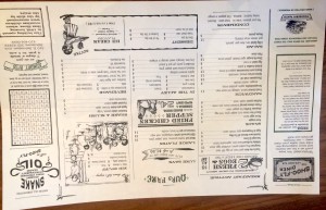
Concurrent with the opening of the theater, Spike Gjerde, owner of Woodberry Kitchen and Artifact Coffee in the Hampden neighborhood, has opened a new “diner-style” restaurant called Shoo-fly. His restaurants are amazing and focus on local sources for all the ingredients. I’ve attached a photo of the “soft-opening” menu from this week. It changes often as the seasons change and the chef innovates.

shoo-flymenu

Both of these join Belvedere Square, a european-style market square that T and I lucked out to buy our house near. It was already a fabulous place, but they’ve recently renovated as well, adding larger outdoor seating areas with umbrellas and awnings and new retro sign painting. T and I go there 2-3 times a week for Atwaters soup and bakery, Neopol Smokery smokehouse, Ceriello’s italian market, Planet Produce produce stand, Grand Cru wine bar, Ikan Sushi, Dutch Floral Garden florist, Matava shoes, Neuveau furniture and decorating. Zen West tex-mex bar and restaurant, Ryan’s Daughter Irish pub and restaurant, etc.

Come on over! Belvedere Square has been one of the great local secrets of Baltimore, with a great collaborative, community presence. Now it’s busting out to be one of the hottest destinations in town. You all will make it harder for us to park there, but we’ll welcome you anyway. <grin>

Posted in Houses | Leave a comment

Usability Woes: Maryland Health Connection

I’ve been hearing about all the technical problems on health exchanges since they launched on Oct 1. I was curious, especially because I live in Maryland- which is way ahead of the game and providing an example to other states. I also know folks involved in developing HealthCare.gov which is one of the best government web sites I’ve ever seen. (UPDATE: It has lots of problems too. Just not the design problems I talk about below.)

So, I went to MarylandHealthConnection.gov to see what my choices might be and how the site worked. Let’s just say this up front: it doesn’t. Here is a list of issues I encountered during a 15 minute attempt that ended with a server failure:

  • Multiple server failures before I started the enrollment process. I finally got to a screen to get started. So, the system can’t deal with the scale of requests even days after launch. I’m not into the conspiracy theories about tea-party-ers paying hackers and bots to attack the sites, but it sure would be a comforting explanation! But crappy software looks just like this.
  • Aggressive “pop-up” interactions as I tried to click on “I’m an individual or family” as my mouse crossed the “I own a small business” side of the screen that obscured the choice I wanted. By the way, these are not mutually exclusive choices, and “I” cannot be a “family.” A better choice would be “I need insurance for myself or my family” and “I need insurance for my small business.”
  • No one with a 4th grade reading level could understand this site, or navigate it successfully. It’s full of bureaucratic terms that only people in the health insurance industry would even begin to understand.
  • I’m asked about my “Consent for Automated Verification.” Basically, I have to say that I consent to automated mining of information about me and my family to verify who I am. And I have to say whether I consent for 1, 2, 3, 4, or 5 years. Huh? How about just for the duration of the application process? I chose 1 year.
  • After consenting, it requires a whole bunch of identity “proofing.” Jargon, anyone? Basically, it’s trying to ensure that I’m really me. It asks for lots of personal information right up front, including my Social Security Number, which immediately made me glance at the address bar to make sure it’s an HTTPS connection (it is). It then asks me some “proofing” questions based on a database that knows A LOT about me, including previous addresses – but not my current cell number. I had to guess at a previous phone number as a choice and got lucky.
  • Next, I had to choose if I was a special type of person, like a provider or counselor, or an individual. The correct choice was a smaller button with the same visual styling – and it appeared second. Who do they think the primary user is? Holy cow.
  • Now, I’m into the form filling part of the system. It’s got a weird navigation model that slides new form elements up onto the screen as you finish previous sections. I’ve never seen anything like it; it was jarring and confusing. But I sucked it up and continued.
  • Form fields are laid out all over the screen, with a tab order of left to right, top to bottom. A single column of fields would be much better, and laying out an address in a zig zag pattern is just weird.
  • None of the data was filled in from my prior entries or the obviously comprehensive database they used for “proofing.” I had to enter it all again.
  • I had to enter both my zip code and my county. It later told me that my zip code was not in the county I chose. I had to lie about the county to continue.
  • All the phone number fields were broken out into three separate fields – area code, exchange, and number. I kept getting errors that “phone numbers should be entered in the form of XXX-XXXX” even though all three I entered were correct numbers. I couldn’t proceed until deleting all the phone numbers. Looking back, that third field must have been for “extension” instead, but I can’t verify that was the problem. Also, the errors were shown at the top of the screen with no indication of which specific fields were in error.
  • I got beyond that to the point where I would have to enter my spouse’s information… and the system crashed again. I wonder what happened to all that sensitive information I entered. Lost? Insecure? Saved? Who knows?
    MHCerrormessage

So, I failed to enroll. And I have no interest in trying again – luckily I currently have insurance through my wife. Woe to anyone trying to do this on their own, and woe to the counselors who have to do this dozens of times a day.

Posted in Interaction Design, Technology | Leave a comment

R.I.P. Midnight McJarrett, the Neighborhood Cat, 2004-2013

We put Midnight to sleep this evening. She was a really good kitty, and it’s quite sad for us.

Midnight -August 2013

Midnight adopted us almost nine years ago when we moved into the house here in Baltimore. She was a nearly feral kitten back then, no more than six months old. We lured her with some milk, and slowly, ever so slowly, she started to trust us. She followed us around in the yard as we worked on the garden. She would jump up next to us when we sat on the porch. She would sneak her way into the house occasionally, but it would freak her out and she would soon run back outside. We gave her treats, and later when we realized her owners weren’t feeding her, starting leaving food out. Over the last year, I was even able to pick her up and she once or twice jumped up into our laps – for about two seconds.

This July, we came back from Cape Cod and Midnight hadn’t been seen for a few days. This was very unusual. T and I were sitting on the porch a few evenings later, and she crawled out of the bushes, her rear left leg mangled from being bitten by something, probably a dog.

Since then, we had been nursing her back to health, going to the vet, keeping her inside, trying to give her medicines. Her foot was healing nicely… but she had this odd cough. It kept getting worse. Friday, when T took her to the vet, they did an x-ray, and she had lots of fluid and spots in her lungs. Seems like it was either congestive heart failure brought on by thyroid disease, or lung cancer. Either way, not a good prognosis. Rather than opt for some sort of radical intervention which may not even help, we had her put down.

Posted in Family, Personal | Leave a comment

Dining Room Window Seat

Over the weekend, I designed and built a window seat in the dining room to replace the cabinets and covering for our old radiator (which was taken out a few years ago). The design came together as I woke up on Saturday morning, and the construction went surprising well! We’re very happy with the results. Now we just need a cushion.

DiningRoomWindowSeat

Posted in Houses | Leave a comment